Update 2010-04-01: Looks like YouTube have made this layout official now, with a few minor improvements! (once again, they release it on April Fools Day! No Joke!)
So, most of you who browse the web quite a lot will have noticed the new facebook layout, but a lot of people won’t have seen the changes planned for youtube yet, so here we go.
I’ve been using the new youtube video page for about 2 weeks now, and originally, I found it a bit awkward to use, so I sent in some suggestions to google (as did, most likely, many others), and this morning, I’ve noticed they have updated the beta page again.
I happened to stumble upon the beta page by accident, thanks to a video posted by Wheezy Waiter (so as a thankyou, most of the screen shots come from his videos!).
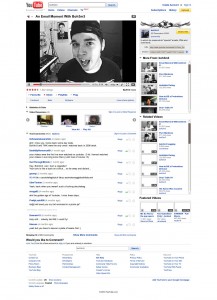
So, most of you will be familiar with the old layout: (as modelled by an old video!)
As you can see, the familiar layout hasn’t changed much since youtube’s launch in 2005, with the comments below the video, and the sidebar (a.k.a. The Doobly Doo) at the side, and underneath that, “More from: <<user>>” and below that, videos youtube thinks are related to the video you’re just watching.
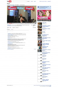
The new layout has kept some of these original features, but generally has tidied up the page:
The comments are still below the video, and at the side, you can still find related videos. But gone are the “More from: <<user>>” box, and the sidebar is now below the video (possibly meaning the term “Doobly Doo” will be more commonly used?)
But by far, the most controversial change is the complete removal of the star rating system. It has now been replaced by a simple Like/Dislike system. Youtube’s reason for this is that most people we either rating videos 5 star, or 1 star, and not many were rating videos 2, 3 or 4 stars.
I totally agree with this (I, myself, usually rated videos 5 or 1), but what I didn’t like, until the change today, was that originally clicking the “Like” button would add the video to your favourites. Now in my opinion, just because I liked a video, doesn’t mean I want to save it into my, already stupidly large, favourites list. So today’s change was great to see.
When you click the “like” button, the following message appears below it:
The only thing I feel is lacking, is to see what the overall opinion of this video is, currently, the only way to I can find to do that, is to search for the video you’re actually watching, and look at the star rating.
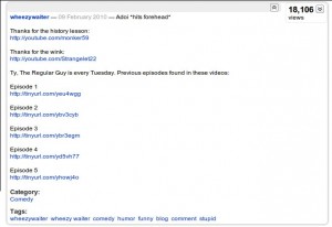
A quick look at the sideba… errm… doobly doo now, one thing you’ll notice is that, like before, you only get to read a small bit of it, but instead of clicking a small blue link that says “(read more)”, you now just put your mouse over it, the box turns blue, and you click which reveals the rest of the description, the category and the video tags. I like this feature, but as some people might point out, you’ll need to scroll down the page to read the description, meaning the video goes off screen. In my opinion though, no matter where the doobly doo is, when you’re reading it, your eyes are not focused on the video anyways. Best thing to do is to pause the video, read the description, then watch it. That will also give the video time to buffer a bit too.
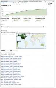
Next thing is the video views count, this is now in the same place as the Doobly Doo, clicking this will give many interesting statistics (to those who appreciate that sort of thing… like me!) as well as the honours that video might have received:
Below this area there are a few options regarding saving the video to playlists, and favourites, along with the like/dislike buttons, and the embedding options.
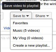
We’ve already looked at the like/dislike system, so lets now look at the “save to” button:
From this drop down list, you can add to favourites, a playlist you’ve created, or create a new playlist.
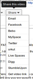
Next to the “save to” button, is “share”:
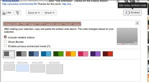
The share button, as you would imagine, allows you to share the video through other services, though if you want to embed the video onto your own site, there’s another button further along which reveals the embedding dialogue box:
From here, you get many more options than you did before, for example, being able to change the colour and size of the video player, though you have been able to do this for ages by tweaking the code. (if you knew how)
Sadly, the code provided still isn’t valid (X)HTML as it still uses the <embed></embed> tags, but rewriting the code to use this is common practice by good web designers now!
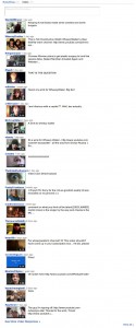
Video responses are now merged in with the video comments, you now have a choice of looking at “Everything” or just the video responses, though at the moment, the “Everything” option seems to only show the text comments, this might just be a bug though.
If you want to see more videos from that user, there is a button above the video, next to the title, that says “<<number>> videos”, clicking on that will display a dialogue with more videos from that user:
You’ll also notice, partner banners have been move up here too, also reduced in size (which makes the “Subscribe now” with an arrow pointing down no longer work!)
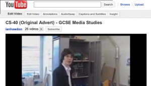
Finally, when you’re watching one of your own videos, the owner options appear above the video too:
(ah, the CS-40 video there… so many memories!)
One thing I forgot to mention, when you search for other videos whiles one is playing, the video shrinks to the side and the results are shown along side it, I don’t see much use in that feature yet, but I’m sure it will come in useful. Also when you’re watching your subscribed videos, youtube will automatically move on to the next one in your list after the one you’re watching finishes.
Overall, I’m impressed with the new layout, it seems to work well and provide a richer watching experience for the viewer. If you want to try it out yourself, this is the original video from Wheezy Waiter which has the link in it to switch you to the beta version.
Let me know you’re experiences with the beta page.


