In my previous post, I talked about my trip to Norway. When I was looking through the photos, I noticed a few were missing! I decided to try and recover the photos from the negatives!
For this tutorial, you will not need photoshop! Instead, you’ll need a free piece of software called GIMP (GNU Image Manipulation Program).
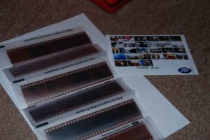
Firstly, I found the negatives.
They were still in the envelope, still in their protective sleeves.
I then needed to find a way of digitising them. I originally tried scanning them, but they just came out black, as the light wasn’t bouncing through the negative the way I hoped! I next tried shining a light through the desired negative, but that was too bright.
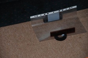
I decided to go for the photographing the negative approach, for this, i needed a background light source, in this case, I used:
- My iPhone with it’s display showing nothing but a white screen
- An A4 polypocket to act as a defuser
- Bluetac to hold the negative in place
- Something to hold the negative to the light level
- A DSLR camera
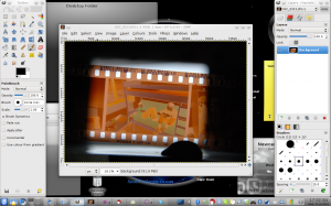
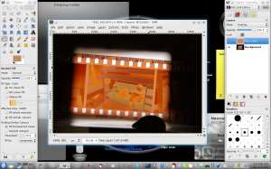
I darkened the room, and lined up the image I wanted in the view finder, and took a picture without the flash. I loaded this image into GIMP
As you can see, the photo worked well, and the defusion stops the individual pixels of the iPhone showing through.
Now, it’s important to realise it’s not just simply a case of inverting the image, firstly, what we need to do is deal with the orange tint that’s on the Kodak branded film.
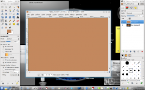
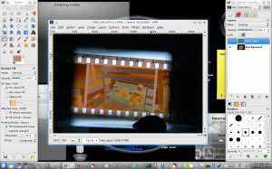
To do this, I used the colour picker tool to select a part between two images. I then created a new layer and coloured it in in this colour.
Then, I changed the mode of this layer from “Normal” to “Overlay”
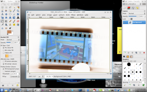
After that, I inverted the overlay (so the orange colour turned a deep blue)
The image is now ready to invert, I flattened the image and inverted the whole image
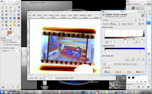
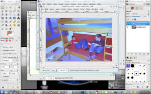
The image, as you can see, isn’t finished just yet, the colours need adjusting. to deal with this, go to “Colours –> Levels”
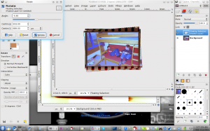
It’s then a case of cutting the picture from the image, and rotating it.
After that, crop it to size.
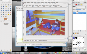
Then fine tune the colours once more by going to “Colours –> Colour Balance…”
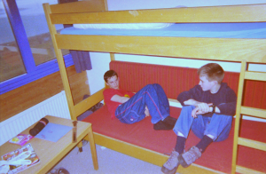
The image is now complete, and to be honest, doesn’t look too bad
This won’t be anywhere near as good as a professional reprint, but it does a good enough job. Sadly, I’m colourblind, so I’m sure someone else could to a much better job than me!


